


Learning how to blend wood console tables with neutral color palettes is a key skill for achieving a sophisticated, balanced, and inviting modern interior. Neutral palettes – whites, grays, beiges, creams, and blacks – are beloved for their calming, versatile nature. However, without the right counterpoint, they can sometimes feel cold or sterile. A wood console table is the perfect solution. It introduces essential warmth, organic texture, and a grounding connection to nature.
This definitive guide provides an expert framework. It explores the professional strategies and techniques needed to seamlessly integrate the natural beauty of wood into a serene, neutral space, creating a look that is both contemporary and timelessly elegant.
What is the Core Principle of Blending Wood and Neutrals?
The core principle is creating harmony through balanced contrast and tonal connection. This involves using the natural warmth and texture of the wood console table as a deliberate counterpoint to the coolness or simplicity of the neutral palette. Simultaneously, subtle connections are created by echoing the wood’s undertones in other neutral elements within the space. The goal is a cohesive, layered look where the wood feels intentional and integrated, not like an afterthought.
This approach celebrates the strengths of both elements. The neutral palette provides a calm, sophisticated backdrop. The wood console injects vital warmth, character, and organic texture. It prevents the space from feeling flat or one-dimensional. This balance is key to achieving a refined yet welcoming atmosphere. The enduring popularity of neutral interiors highlights the need for strategies to add warmth and personality.
Why Do Undertones Matter in Both Wood and Neutrals?
Understanding undertones is a professional secret to successfully blending wood with neutrals. Both wood species and neutral paint colors have subtle underlying hues – either warm (yellow, red, pink undertones) or cool (blue, green, purple undertones). Creating a harmonious blend often involves either matching these undertones or creating a deliberate, balanced contrast.
How to Identify Warm vs. Cool Wood Tones?
Identifying wood undertones is key to pairing them effectively.
- Warm Woods: Typically have visible yellow, orange, or reddish hues. Examples include red oak, cherry, mahogany, and many natural pine tones. These woods bring a cozy, inviting feel.
- Cool Woods: Often have grayish, taupe, or slightly greenish casts. Examples include ash, maple (sometimes), and woods treated with a gray or weathered wash. These woods feel more modern and serene.
- Neutral Woods: Some woods, like white oak or walnut, can have relatively neutral undertones, making them highly versatile. Walnut’s richness pairs well with both warm and cool schemes.
How to Identify Warm vs. Cool Neutral Paints?
Neutral paints also have distinct undertones that dramatically affect how they feel in a room.
- Warm Neutrals: Whites with a creamy or yellow base, beiges with pink or yellow undertones, and warm grays (often called “greige”).
- Cool Neutrals: Crisp, pure whites with a blue undertone, grays with blue or green undertones, and cool taupes. Holding paint swatches next to your wood console table under natural light is the best way to see how their undertones interact.
Why Does Matching or Contrasting Undertones Matter?
The choice to match or contrast undertones creates different effects.
- Matching Undertones: Pairing a warm wood (like oak) with a warm neutral (like a creamy white or warm gray) creates a very cohesive, harmonious, and cozy feel. This is common in natural wood console styling for Scandinavian interiors.
- Contrasting Undertones: Pairing a warm wood (like walnut) with a cool neutral (like a crisp white or cool gray) creates a more dynamic, modern, and high-contrast look. The warmth of the wood stands out beautifully against the cool backdrop. This is often seen in rustic wood console table ideas for modern homes. Both approaches can be successful, but the choice must be intentional.
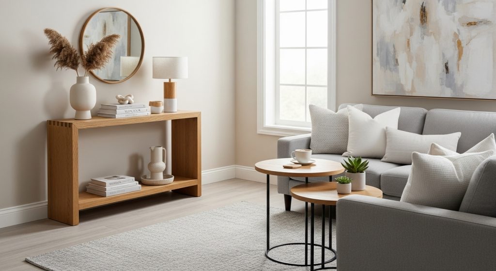
How to Choose the Right Wood Console for Your Neutral Palette?
Choosing the right wood console table is the foundational step. The specific type of wood, its finish, and the table’s overall style must work cohesively with your chosen neutral scheme. Consider both the undertones and the desired level of contrast.
Which Light Woods Pair Best with Cool Neutrals?
Light woods often pair beautifully with cool neutral palettes (crisp whites, cool grays). The combination feels airy, modern, and serene.
- Ash: With its often grayish undertones, ash wood integrates seamlessly with cool grays.
- Maple: Naturally light and often cool-toned, maple offers a clean, minimalist look against white or gray walls.
- Whitewashed Pine or Oak: Applying a whitewash finish to a warmer wood neutralizes its yellow tones, making it compatible with cooler schemes while retaining texture.
Which Warm Woods Complement Warm Neutrals?
Warm woods naturally complement warm neutral palettes (creamy whites, beiges, warm grays). This creates a very cozy, inviting, and harmonious atmosphere.
- Oak (Red or White): Natural oak, especially white oak with its subtle warmth, is a classic pairing with warm neutrals.
- Pine: Natural pine often has yellow undertones that work well with creamy whites and beiges.
- Cherry: With its reddish hues, cherry wood adds richness to a warm neutral scheme.
How Does Walnut Bridge Warm and Cool Palettes?
Walnut is a remarkably versatile wood. Its rich, deep brown color has relatively neutral undertones. This allows it to work beautifully with both warm and cool neutral palettes. Against cool whites and grays, walnut provides a sophisticated, grounding warmth. Against warm beiges and creams, it adds depth and richness. This versatility makes it a popular choice in many modern interiors.
What About Painted Wood Consoles?
A painted wood console can also work within this scheme. Painting the console a specific neutral shade (perhaps a slightly darker gray than the walls, or a classic black) allows you to control the color precisely. You can then introduce the warmth and texture of natural wood through accessories like trays, bowls, or picture frames placed on top. This offers another layer of control when blending elements.
How Do You Create Visual Connection and Repetition?
Creating visual connection is key to making the wood console feel integrated, not isolated. This is achieved through the principle of repetition. By subtly echoing the wood’s tone or texture elsewhere in the space, you create a cohesive visual language that ties the room together.
How to Repeat the Wood Tone in Other Accents?
Repeat the specific wood tone of your console table in smaller accents throughout the space. This creates a sense of rhythm and intention. Consider using the same wood for:
- Picture Frames: Simple frames for artwork or photos.
- Floating Shelves: Add a small floating shelf on another wall.
- Legs of Other Furniture: Perhaps the legs of an armchair or a side table.
- Small Decorative Objects: A wooden bowl or sculpture. These small echoes make the presence of the wood feel deliberate and harmonious.
Can You Mix Different Wood Tones?
Yes, you can mix different wood tones, but it requires a careful approach. The key is to ensure the undertones are compatible. Mixing a very warm yellow pine with a cool gray ash can sometimes clash. However, mixing woods within the same temperature family (e.g., oak and walnut, both relatively warm/neutral) often works beautifully. Aim for a clear dominant wood tone (from your console) and use other woods as secondary accents. The variation adds depth and a collected feel. The art of mixing wood tones is a skill developed through practice.
How Do You Use Contrast Effectively?
While connection is important, contrast is what creates visual interest and makes the wood console “pop.” Using elements that deliberately contrast with the wood’s warmth or texture is a key professional technique for creating a dynamic and sophisticated look.
What is the Power of Black Accents?
Black accents are incredibly powerful when paired with a wood console and a neutral palette. Black provides a strong, grounding contrast that feels modern and sophisticated. Use black in:
- Mirror Frames: A simple, thin black metal frame around the anchor mirror.
- Lamp Bases: A matte black lamp base offers a sleek counterpoint.
- Picture Frames: Black gallery frames make artwork stand out.
- Decorative Objects: A black metal tray, bowl, or candlesticks. These black elements act as visual punctuation marks. They help to define shapes and add a graphic edge to the composition.
How Does White Create a Fresh Counterpoint?
White provides a fresh, bright counterpoint to the warmth of the wood. This is especially effective with darker wood tones like walnut. Use white in:
- Ceramic Vases or Pots: Simple shapes in a crisp white glaze feel clean and modern.
- Marble Trays or Objects: White marble with gray veining adds a touch of cool elegance.
- Lampshades: A crisp white lampshade provides clean light and contrast. The interplay between the warm wood and the bright white creates a look that feels both airy and grounded.
How Do You Layer Neutral Textures for Depth?
Layering a variety of neutral textures is essential for preventing a neutral room with a wood console from feeling flat or boring. Texture adds depth, tactile interest, and a sense of coziness. It is the secret ingredient that makes a minimalist or neutral space feel rich and inviting.
Why is Texture Crucial in a Neutral Palette?
Texture is crucial in a neutral palette because when color variation is limited, texture becomes the primary way to create visual interest. A room filled only with smooth, flat surfaces in neutral tones can feel sterile. By incorporating a mix of rough, smooth, soft, and hard textures, you create a subtle richness and complexity. This tactile dimension is what makes the space feel welcoming and complete. The importance of texture in sensory design is a growing field of study.
How to Incorporate Stone and Ceramic Elements?
Stone and ceramic elements add an earthy, natural texture that complements the wood beautifully.
- Stone Trays: A tray made from marble, slate, or travertine adds a cool, smooth counterpoint.
- Ceramic Vases and Bowls: Look for pieces with interesting glazes – matte, crackled, or slightly ribbed finishes add subtle texture. Unglazed terracotta also provides a warm, earthy feel.
- Concrete Objects: Small concrete planters or decorative objects offer a modern, industrial texture.
What is the Role of Woven Materials?
Woven materials are essential for adding softness and organic texture.
- Baskets: Large woven baskets made from seagrass, wicker, or jute placed under the console are perfect for storage and add significant warmth.
- Textile Art: A woven wall hanging above the console can serve as a soft, textural anchor piece.
- Small Woven Mats: A small woven placemat can be used on the tabletop as a base for other objects.
How Can Textiles Soften the Look?
Textiles provide essential softness and comfort.
- Table Runner: A simple runner made from natural linen or a nubby cotton blend can soften the console’s surface.
- Upholstered Stool: If space allows, a small stool upholstered in a textured neutral fabric (like boucle or linen) tucked under the console adds a plush element.
- Throw Blanket: A softly folded wool or cashmere throw placed in a basket underneath adds a layer of cozy texture.
How Do You Style the Tabletop for a Balanced Look?
Styling the tabletop involves arranging your chosen accessories in a way that feels balanced, uncluttered, and harmonious with both the wood console and the neutral surroundings. The principles of height variation, asymmetry, and negative space are key.
How to Use the “Anchor, Height, Filler” Formula?
The “Anchor, Height, Filler” formula is a reliable starting point.
- Anchor: Your mirror or artwork is already on the wall.
- Height: Place your tallest items first, often a lamp on one side and a vase with branches on the other. Use asymmetry for a modern feel.
- Filler: Layer in the lower items – a stack of books, a tray, decorative objects – using the “Rule of Three” for groupings. Ensure you leave plenty of negative space. This structured approach helps to create a balanced composition.
Why is Negative Space So Important?
Negative space is crucial for preventing a cluttered look, especially in a neutral scheme where the focus is on simplicity. Do not feel the need to fill every inch of the tabletop. Allow empty space around your objects. This visual breathing room makes the arrangement feel calmer, more intentional, and allows each piece to be appreciated. This minimalist sensibility is key.
How to Incorporate Greenery Naturally?
Greenery is essential for adding life and an organic touch that bridges the wood and the neutral palette. As detailed in our guide on decorating a wooden console with indoor plants, choose simple plants like snake plants or ZZ plants. Place them in pots made from natural materials like terracotta or concrete. A few cut branches in a simple ceramic vase also work beautifully. The green adds a vital pop of natural color.
Conclusion
Learning how to blend wood console tables with neutral color palettes is about creating a sophisticated dialogue between warmth and serenity. By carefully selecting a wood console with the right tone and finish, establishing connections through repeated tones, creating interest with deliberate contrasts, and layering a rich variety of neutral textures, you can achieve a look that is both modern and deeply inviting. This harmonious blend transforms your entryway or living space into a calm, curated, and welcoming environment – a perfect testament to the timeless appeal of natural design.


